
Square Cash
Card Linking
Process and explorations around the motion design of the app’s card linking flow
PHASE 1:
Entry Animation
Having already defined the text animation strategy for the amount entry step (see above video), it next became necessary to determine whether and how to propagate this strategy throughout the rest of the app, starting with the card-linking flow.
The initial pass comprised a direct port of the existing behavior, simply instantiated to the new use case. Quickly, the longer text format and need for a cursor surfaced as presenting challenges to the existing motion design solution.
Experimentation had shown that the insertion of text proved especially visually incongruous with the prior animation model. Thus, the decision was made to opt for the simpler and more flexible strategy of excluding text entry animation from this step.
PHASE 2:
Step Transitions
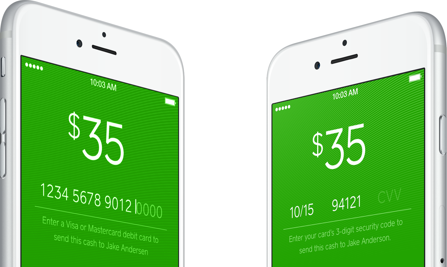
Following text entry animation, the next interaction to consider was that of stepping through the various items in card linking process. As polished visual compositions for these distinct steps had already been delivered by another designer (comps shown below), the remaining effort consisted of synthesizing these into a cohesive, animated whole.
Exploration
As before, the first step was to prototype the most straightforward translation of the source material. In making these visual design comps interactive, it became apparent that the only way to step forward or backward through the flow would be to enter or delete text. This interaction was especially troublesome given that all fields could never be visible onscreen simultaneously. The anxiety and mental load thus produced was made appreciably palpable by this prototype.
Solution
Given the newly surfaced interaction considerations, sufficient grounds were established to justify a second pass by the visual designer—specifically, one that would include all form fields onscreen simultaneously. Though some visual breathing room was sacrificed to acheive this goal, the animated end result put to rest any doubts over the comparative advantages of this direction.
Expansion
With any design solution, there is always room for improvement, and this was no exception. Additional playful and helpful touches were added when revisiting this interaction within the ‘Settings’ screen, such as flipping the card glyph mid-entry to indicate recognition of card issuer, and doing so once more to provide an embedded visual hint to users seeking to locate their CVV.