Intro
PlanGrid—or “GitHub for blueprints”, as some describe it—is a document version control app and collaboration tool for construction professionals.
Contrary to what one might think, blueprints are not set in stone at the time of issue. Rather, they are in a state of constant flux as construction teams discover obstacles and conflicts not anticipated at the time of design. With this in mind, PlanGrid seeks to keep all team members on the same page during the building process, while at the same time providing an industry-leading dedication to usability and intuitive user experience.
PlanGrid’s tablet app for real-time reference and annotation is central to the product experience, though this experience could not exist without the desktop web component. This web component is used, among other things, for uploading new blueprints and making updates to existing ones. The extensive duration of this upload process (which is due to the typically large number of uploads as well as the processing power required to compress them into PlanGrid’s proprietary algorithm), and the convenience of uploading files directly from the device on which they are stored, are two of the main reasons driving the utilization of a desktop component.
Background
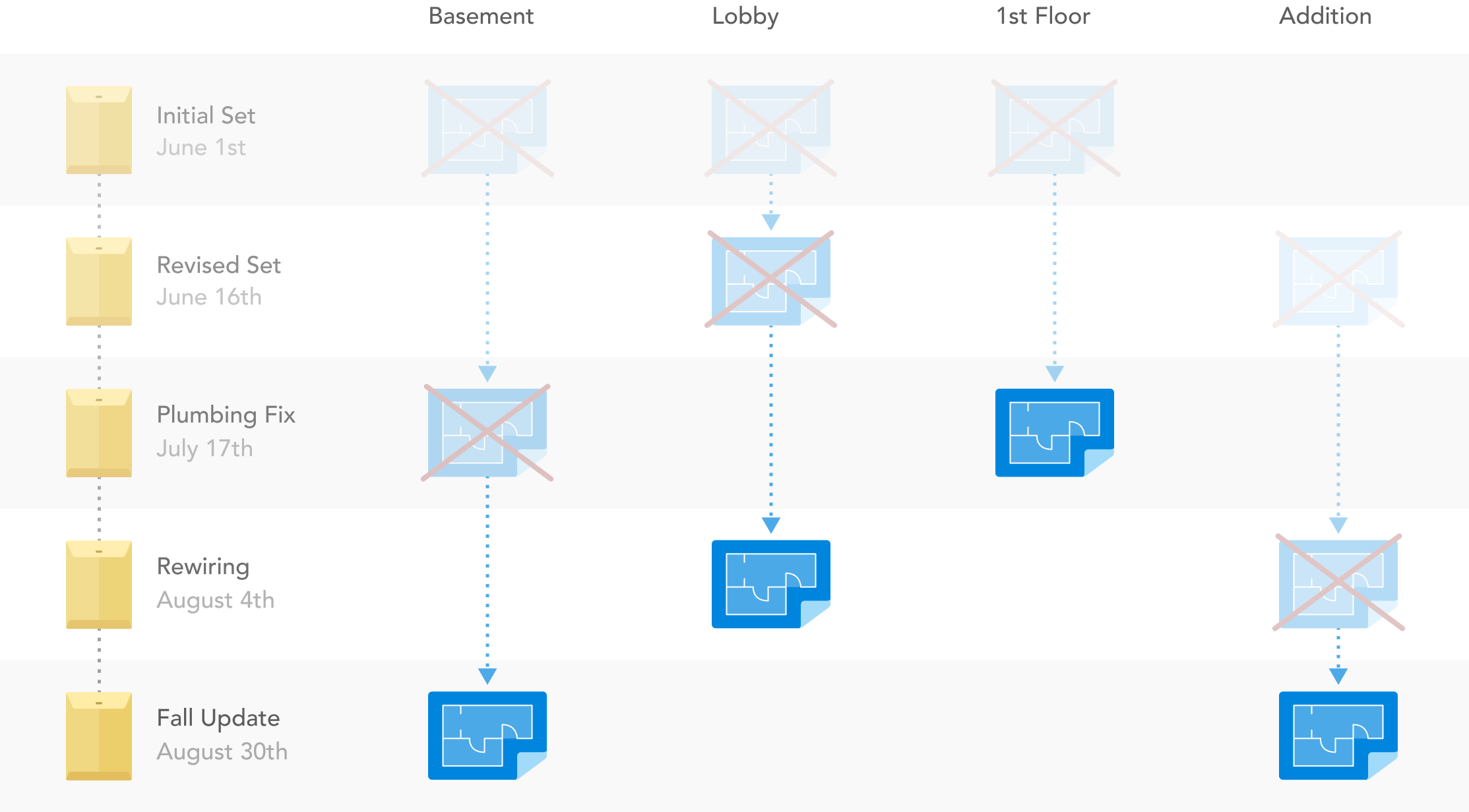
The “GitHub for blueprints” concept of version control (illustrated below, along with an on-blueprint example of how such changes are recorded) has value beyond the maintenance of an accessible “source-of-truth” from which to safely build.
In the notoriously litigious construction industry, having a detailed chronological record of changes and updates to blueprints is also important for troubleshooting, establishing culpability in the case of errors, and myriad other reasons.
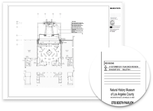
One testament to the importance of this is the practice of keeping “slip-ins”, outdated blueprints that are received after newer ones but still kept on file to record the evolution of the intended designs.
Problem
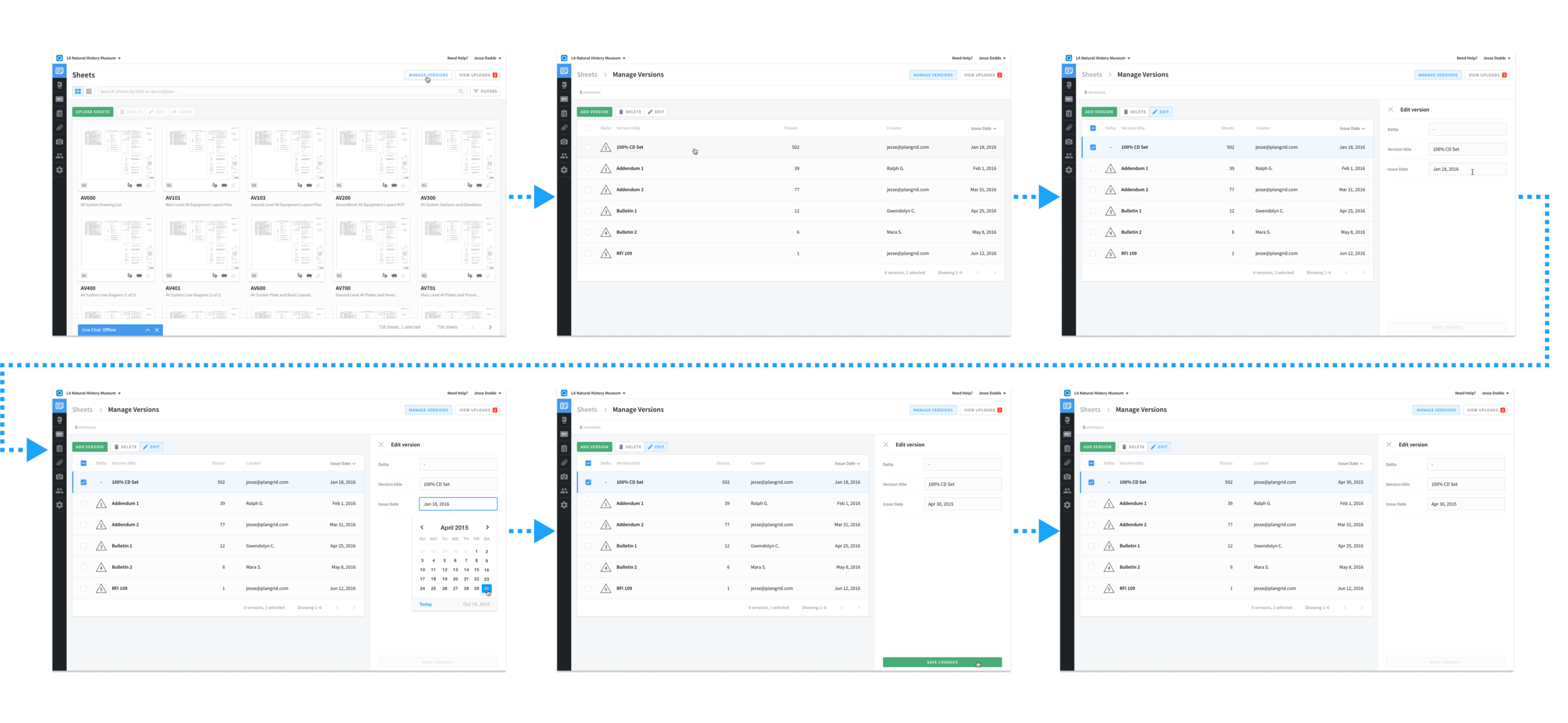
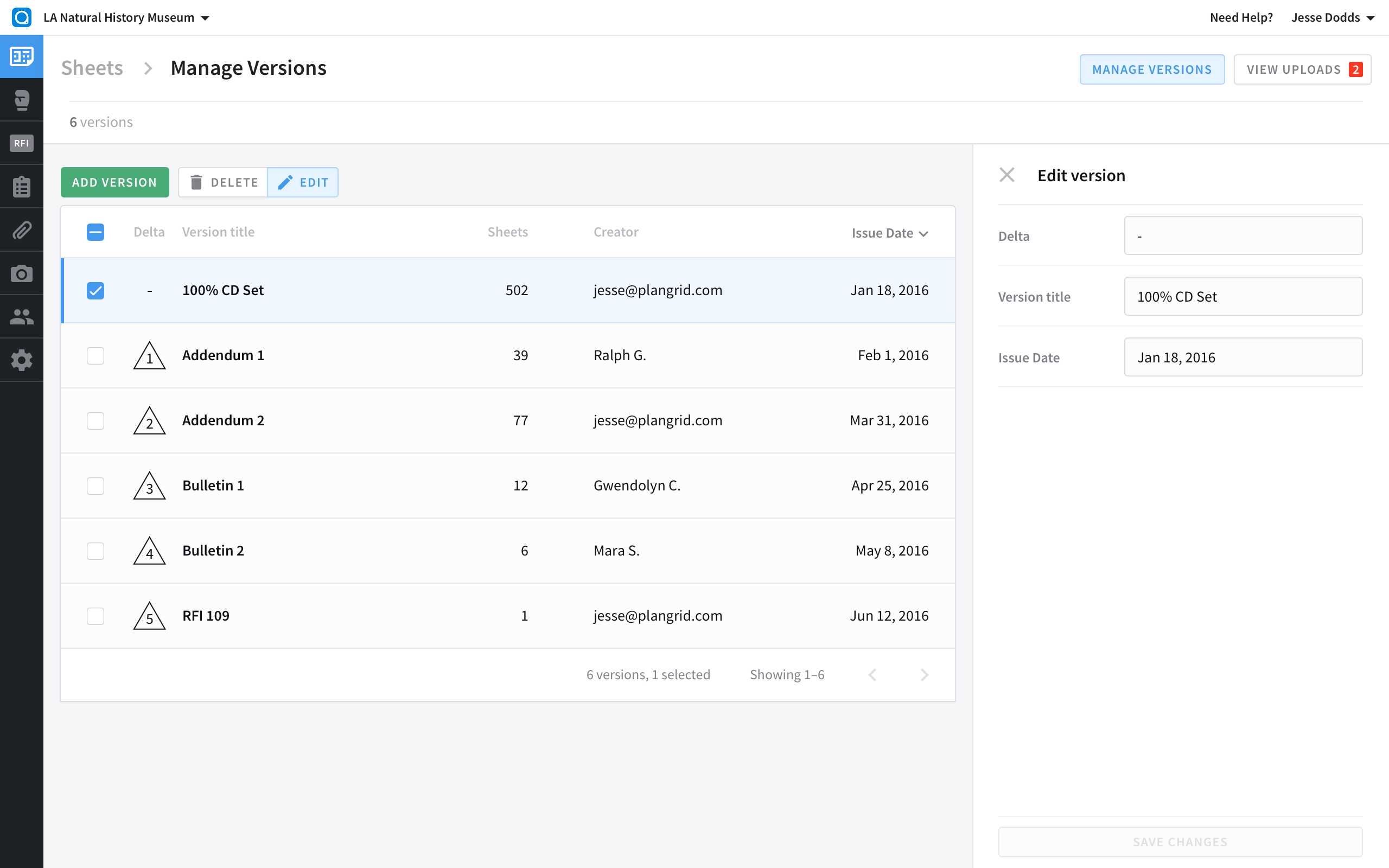
One major feature limitation of PlanGrid was the inability to edit the metadata for sets of blueprints after upload. For example, if an old set of blueprints were uploaded after newer ones (for aforementioned reasons), there would be no way to manually correct the ordering; rather, the set’s date would automatically default to its time of upload. This is especially troublesome considering PlanGrid defaults to showing only the most recent set’s version of each sheet.
The existing workaround for users in this situation was to delete all the more chronologically recent sets received before the out-of-order one, and then upload all sets in order. Not only could this take many hours (after factoring in upload and processing times), but it would require forfeiting all annotations and other collaborative edits made within these sets using the PlanGrid product, thus seriously undermining part of its core value. Thus, a way to edit blueprint sets’ metadata was sorely needed.
Process:

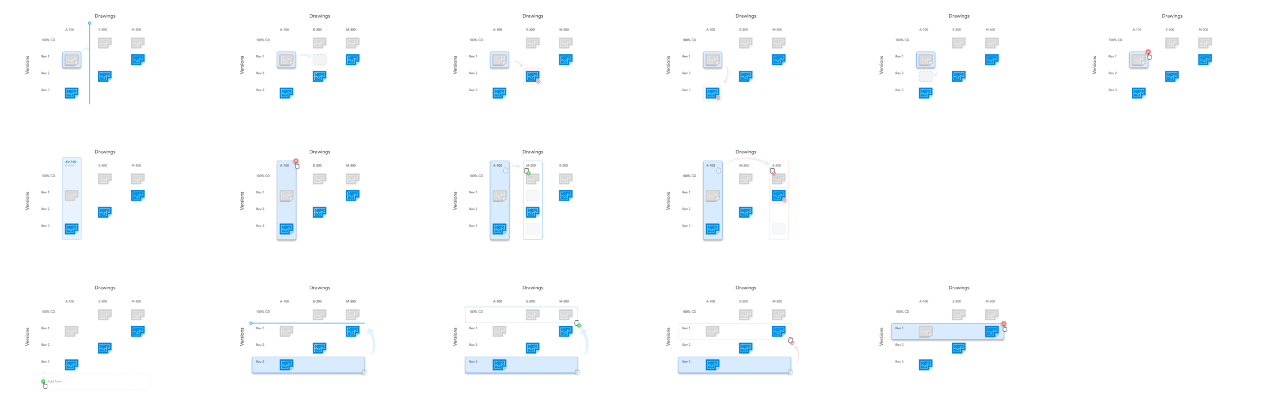
1. Outline

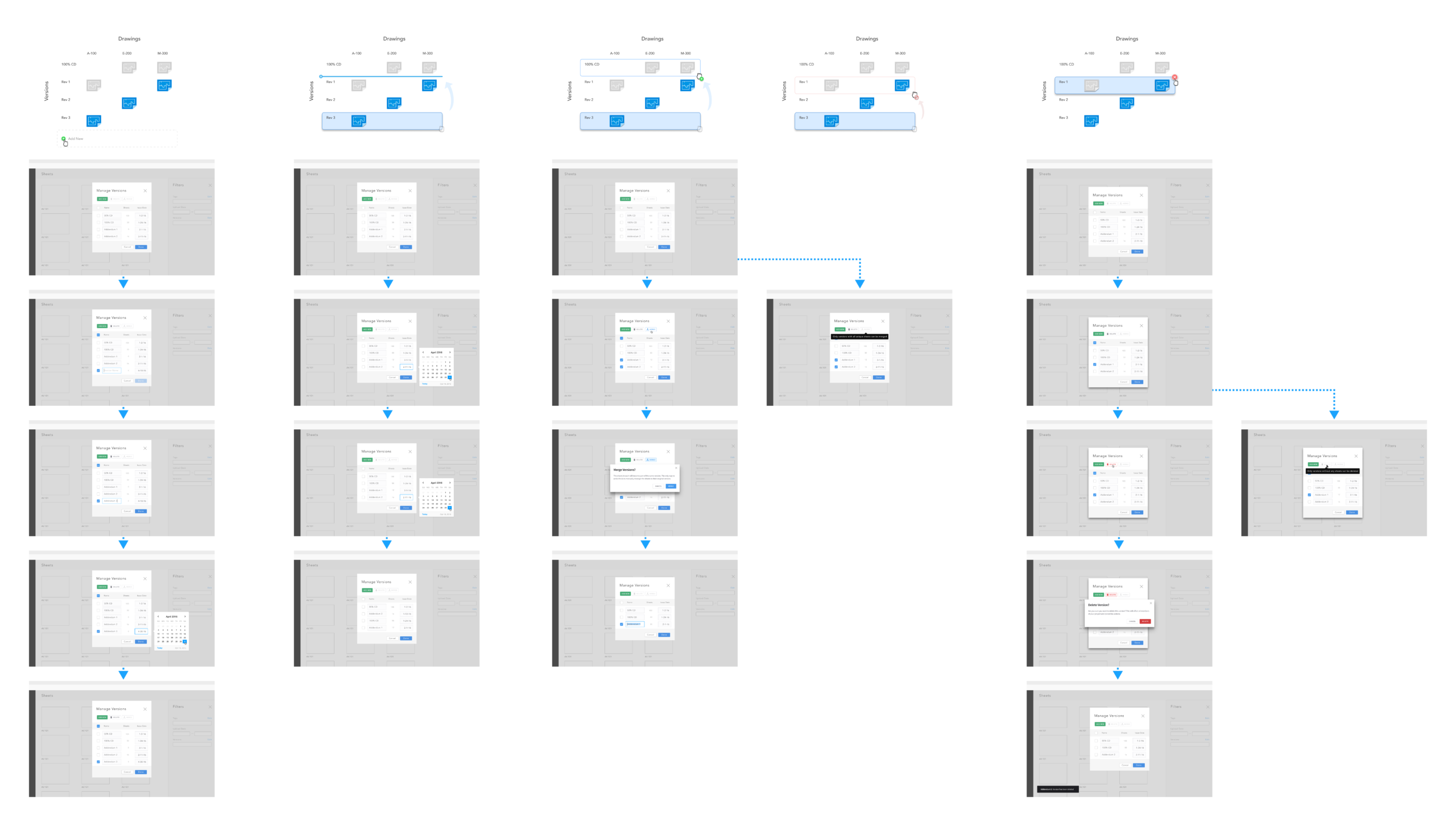
To begin the design process, a visual map was used. Because this sprint was merely one leg of a larger push to expand functionality around editing sheet metadata, and because much of the existing terminology was insufficient in clearly distinguishing between some of these types of edits (e.g., when one chooses to “delete a blueprint”, are they deleting only the current version of that blueprint, or all versions of it?), the decision was made to visually map all types of operations, rather than just those relevant to the current sprint (which are shown in the third row below.) Eventually, these diagrams would be used as a basis for laying out the flow comps scoped for delivery.
2. Research

Once the project problem and scope was clearly mapped, the next step was to compile all relevant resources and precedents that could inform design direction.
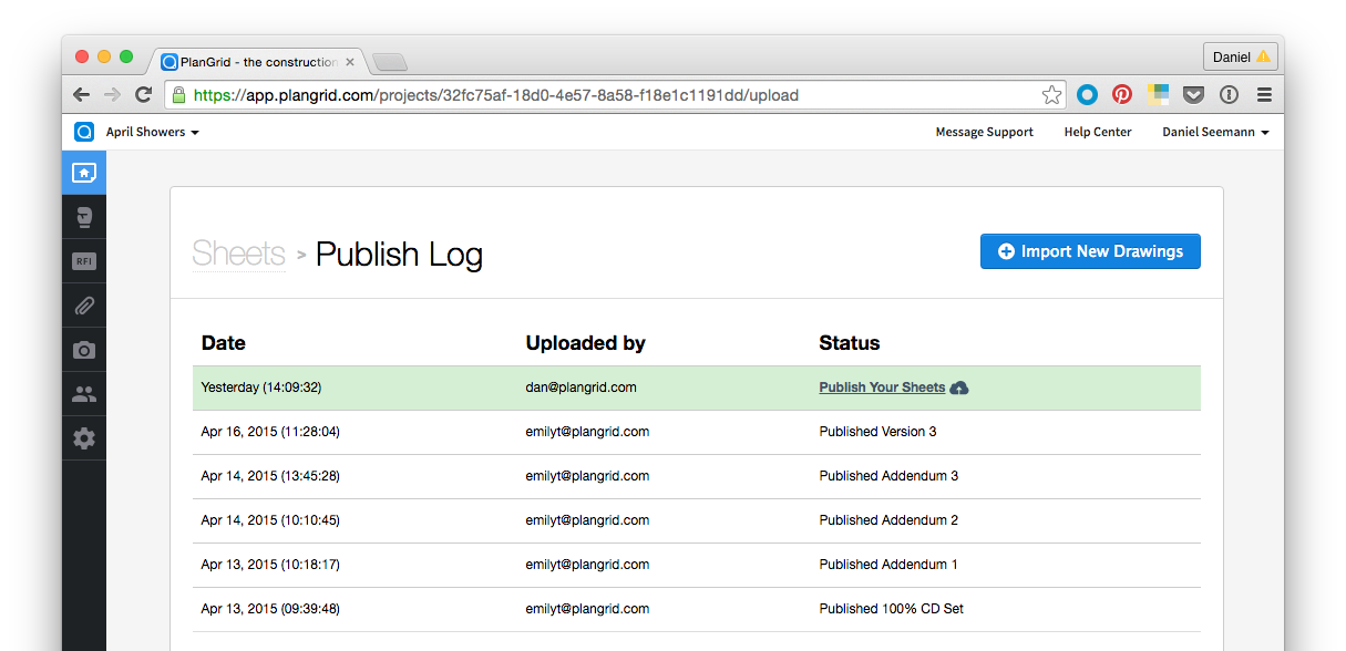
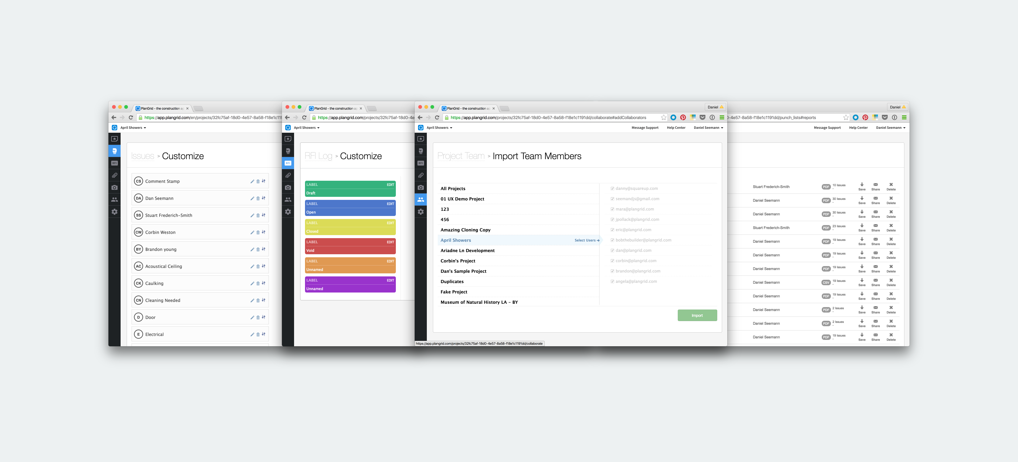
The most obvious first step was to map all potential touchpoints to the new functionality existing within the current product ecosystem. As the sprint dealt with editing metadata for blueprint sets, and blueprint sets were only managed within the web product, the web product was combed through, and all UI referencing said functionality was visually noted. The purpose of this was to take stock of any UI that may be affected by changes arising from the current design sprint.
In addition to content and functional considerations, existing design systems within the product ecosystem were also taken into account. Not only did this roundup of screens featuring similar functionality yield a wide range of design cues from which to draw, it also provided a handy checklist of screens whose design could be affected by any design decisions arising from the current sprint.
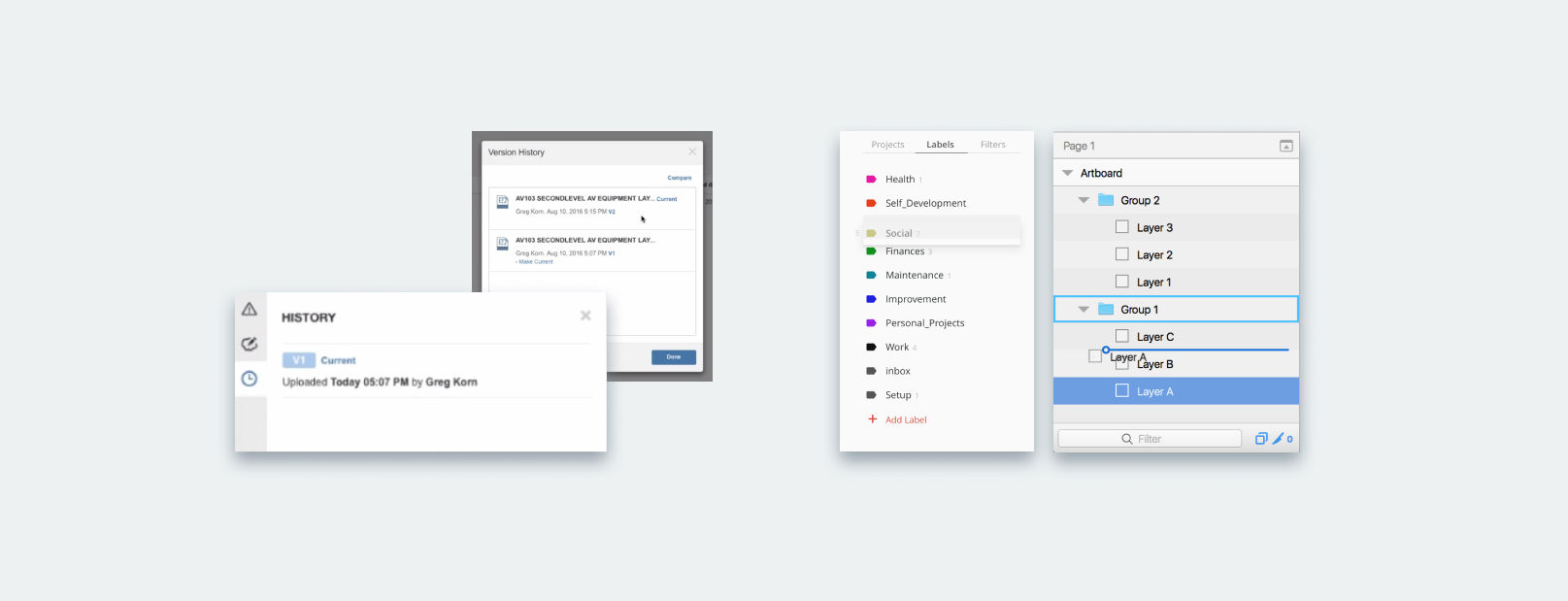
Beyond taking stock of internal UI precedents, a wide range of other UI systems were surveyed to ascertain any visual vocabulary that might have been familiar to users in analogous situations, and thus might have been useful in informing the decisions in the current design sprint. Not only did these UI systems include obvious choices like analogous features offered by market competition, but they also included less readily obvious but conceptually adjacent functionality in unrelated software, such as drag-and-drop grouping and re-ordering UX flows in non-construction-related productivity software.
3. Generate

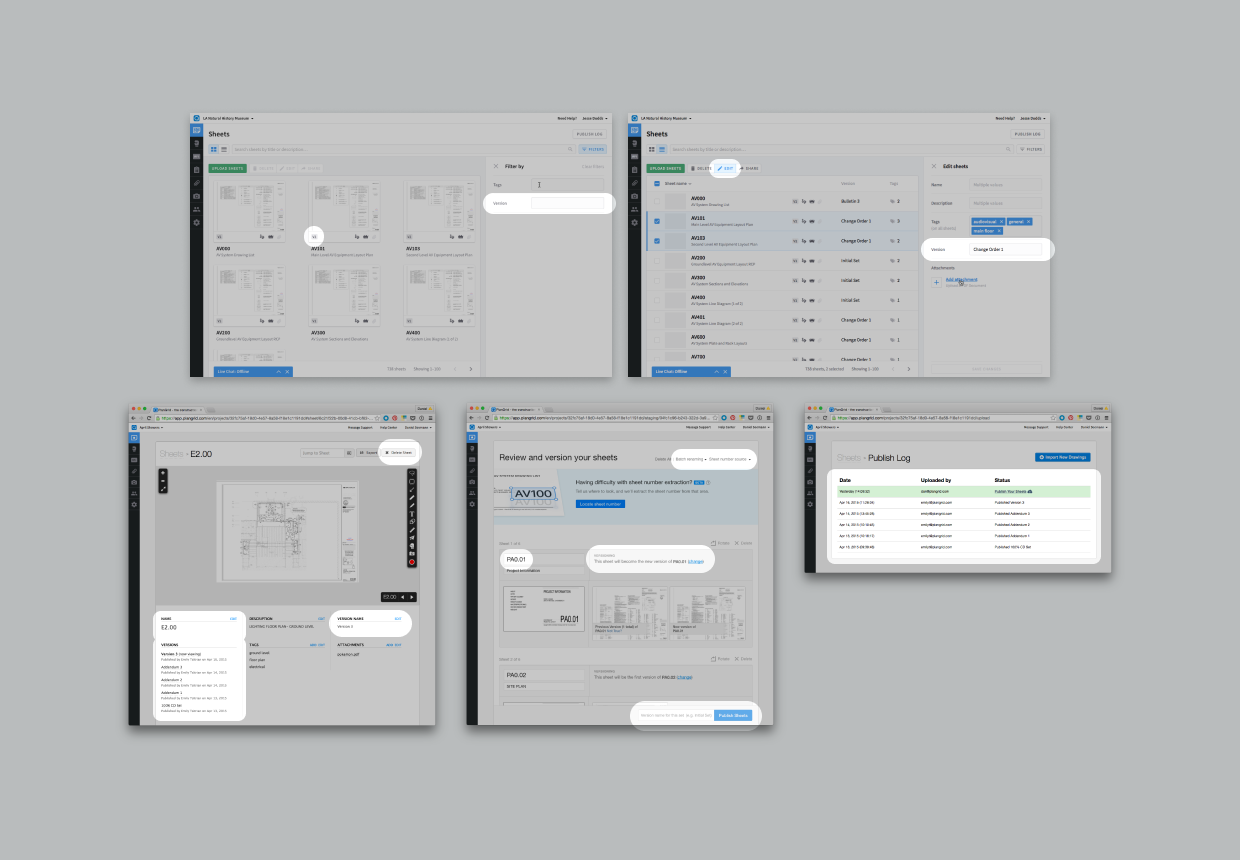
Iteration
Brainstorming sessions were used to generate a number of comps and sketches communicating early options for design directions. From these, several of the most promising that still represented a broad spread of potential directions were chosen.
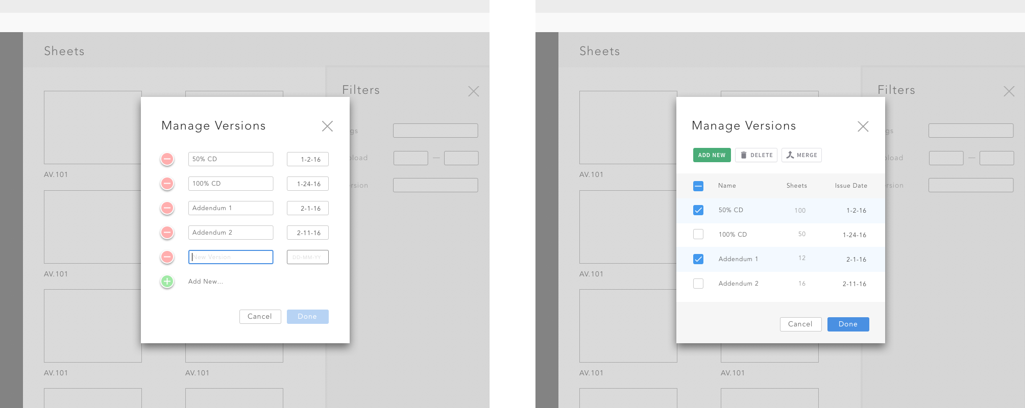
Deliberation
These options were then discussed by the design team and relevant project stakeholders, who used them as a basis for identifying relevant selection criteria, such as elegance and intuitiveness of the solution, adherence to existing or incoming design patterns, and prospective ease of implementation.
Selection
After discussion, it was determined that the solution utilizing the side panel (first option above), while potentially easy to implement, was too visually similar to an existing flow that lived at a different level of hierarchy within the product. A lightbox solution (like the second two screens above) was determined to more successfully communicate the concept that changes made in this flow would propagate broadly to the content below them within the product’s hierarchy.
4. Refine

With the high-level design direction chosen, it now needed to be applied to all scoped functionality. The ‘outline’ diagrams shown earlier were here used as a basis for comping corresponding flows. With all details worked out, flows were approved by design and engineering teams as ready to test.
5. Test

Overview
In order to validate the usability of the flows, eight construction professionals were remotely tested (and their impressions recorded) using a clickable prototype hosted the ‘Marvel App’ web product. Participants were briefly interviewed, then asked to accomplish a simple task using the prototype without help and while “thinking aloud.” Afterwards, they were briefly questioned about their experience.

Findings
Despite a 100% success rate, the testing yielded some invaluable feedback—namely, that most contractors had far more blueprint sets than previously assumed. In contrast to PlanGrid’s internal design and education resources showing 2–10 sets per project, the interviewees revealed in the course of interviewing that their own projects had dozens of them. As content needs can strongly inform design decisions, this important finding was verified with our company’s industry experts and data team, both of whom confirmed it.
6. Implement

In response to the test results, an important course-correction was in order. Though the initial design direction of using a lightbox for viewing and editing blueprint sets worked well when there was a relatively small number, it failed to scale well to much larger numbers of sets.
Thus, the decision was made to revert to an earlier design exploration better suited to these needs. Instead of a lightbox, sets would now be edited natively in a separate page. Though the navigational clarity was less pronounced with this option, the usability gains from the extra real estate as well (as the ability to scroll and paginate sets) were more than enough to make up for this concession.